Blink Once If You Can Hear Me: The Gloriously Unhinged Web Design Era That Assaulted Our Eyes and Owned It

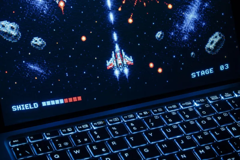
Imagine you've just opened a webpage. Before you've read a single word, a MIDI version of 'All Star' by Smash Mouth begins playing from somewhere on the page. The background is a tiled image of outer space — not a photo of space, but a drawing of space, with cartoon stars and at least one planet that appears to be winking. The text is lime green. No, wait — it's hot pink. It's both, actually, alternating by paragraph. There's a hit counter in the bottom right corner displaying a number in the low hundreds, and next to it, a small animated GIF of a flame that has been burning continuously since 2003.
Welcome to the golden age of personal web design. Population: everyone with a GeoCities account and a dream.
The Design Philosophy of 'Why Not Both'
Modern web design operates on a principle of restraint. White space is considered a feature. Designers talk about 'visual hierarchy' and 'reducing cognitive load' and 'letting the content breathe.' These are legitimate concepts that produce websites that are usable, accessible, and pleasant to look at.
Early internet web design operated on a completely different philosophy: why would you use one thing when you could use all of the things?
This wasn't laziness or ignorance, though it was sometimes both of those. It was enthusiasm. The early web gave regular people — not graphic designers, not developers, just regular people with opinions and access to a keyboard — the ability to make something and put it on the internet for the world to see. That was astonishing. It had never been possible before. And when you handed someone that kind of power for the first time, they were not going to use it conservatively.
They were going to use every color. They were going to animate everything that could be animated. They were going to put their favorite song on autoplay and their best friend's birthday in a blinking text box and their favorite quotes in a marquee that scrolled across the bottom of the screen like a news ticker covering extremely personal information.
Comic Sans: The Most Misunderstood Font in Human History
Let's address the elephant in the room — or rather, the slightly rounded, friendly-looking elephant with no serifs and an inexplicably bad reputation.
Comic Sans was designed in 1994 by Vincent Connare, who based it on the lettering in comic books. It was casual, approachable, and readable at small sizes. For these reasons, it became the default 'fun' font for an entire generation of personal websites, school projects, birthday invitations, and office memos from people who wanted to seem approachable but ended up seeming unhinged.
By the early 2010s, hating Comic Sans had become something of a cultural pastime. Graphic designers talked about it with the weary contempt of someone who has explained the same thing too many times. There were 'Ban Comic Sans' movements. The font became shorthand for 'this person does not take design seriously.'
But here's the revisionist take that XYZ2010 is prepared to defend: Comic Sans on a personal website in 2002 was correct. It was a font that said 'a human made this, for fun, because they wanted to.' It communicated warmth and personality. It was the typographic equivalent of a handwritten note, and the fact that it was technically imprecise was part of the charm.
The problem was never Comic Sans. The problem was using Comic Sans in a legal document or a hospital sign. On a personal website about your obsession with 'The Lord of the Rings'? Comic Sans was doing exactly what it was supposed to do.
The Animated GIF: Background Feature, Foreground Chaos
Before animated GIFs became the reaction-image currency of Twitter and Tumblr, they were primarily used as website decoration. And 'decoration' here means 'literally everything on the page was animated if it could be.'
Under construction signs — the classic. Every website had a period of being 'under construction,' and this was communicated not by a simple text note but by an animated GIF of a tiny construction worker digging with a shovel, or a spinning hard hat, or a blinking orange warning sign. The fact that most of these websites were perpetually under construction and never actually finished was treated as a minor detail.
Button GIFs. Every personal page had a collection of tiny 88x31 pixel button images that linked to friends' pages or declared affiliations: 'Netscape Now,' 'Best Viewed in 800x600,' 'This Site is IE Compatible.' Some of these buttons were animated. Many were fluorescent. All of them were arranged in a dense grid at the bottom of the page like a tiny digital quilt of internet identity.
Star GIFs. Sparkle GIFs. The infamous 'glitter text' generator, which allowed you to make your name or a meaningful phrase appear in shifting, animated glitter colors that made it essentially unreadable but devastatingly glamorous.
The Autoplay Music Problem (That Nobody Thought Was a Problem)
The MIDI autoplay was perhaps the defining user experience failure of early web design — and the reason it's a failure is also the reason it was so widespread: the person who built the site loved that song and assumed you would too.
MIDI files were tiny. They loaded fast. They could approximate almost any pop song with a combination of synthesized instruments that sounded vaguely like the original if you were already familiar with the original and willing to do some imaginative work. And they started playing the moment you opened the page, automatically, at full volume.
If you were browsing the internet at midnight with your family asleep, opening the wrong personal homepage could result in a tinny, synthesized version of 'My Heart Will Go On' blasting from your desktop speakers at a volume that suggested the original Celine Dion was somehow physically present in your bedroom. The scramble to find the stop button — usually buried somewhere in the page, sometimes invisible — was a formative experience for an entire generation.
The Tiled Background: A Statement About the Universe
Modern websites use solid colors or subtle gradients as backgrounds. Early personal websites used tiled images. A small pattern — flames, stars, roses, the American flag, a specific shade of purple that appeared in no other context in nature — repeated endlessly across the entire background of the page, behind all the text, making everything slightly harder to read and significantly more intense to look at.
The tiled galaxy background was the Platonic ideal of this aesthetic. A small image of space — dark blue, scattered with white dots, possibly featuring a nebula or two — repeated until it filled the screen, giving every page the impression that it was floating in the cosmos. This was used for everything: fan pages for bands, personal diaries, recipe collections, homework help sites. Everything floated in space. Everything was part of the universe.
It was, in its way, a very democratic design choice. Space belongs to everyone.
Why Modern Design Feels Like a Library After Hours
Minimalism is correct. Clean layouts are correct. Accessible typography and adequate contrast ratios are correct. This is not up for debate.
But spend enough time on modern websites and something starts to feel slightly sterile. You can visit ten different company websites and they'll have the same font stack, the same color palette of muted earth tones, the same hero image of a smiling person using a laptop in a coffee shop. They're well-designed. They're completely interchangeable.
The early internet's chaotic, neon, Comic-Sans-soaked, autoplay-music-having personal websites were not interchangeable. They were aggressively, sometimes painfully, individual. You knew immediately whose site you were on, what that person cared about, what music they were listening to, and how they felt about glitter text (usually: positively).
The visual chaos wasn't a failure of design. It was an excess of personality. And personality, it turns out, is the one thing you cannot template your way into.
The tiled galaxy backgrounds are gone. The MIDI files are silent. The hit counters have stopped counting.
But somewhere, on an archived GeoCities page that nobody has updated since 2004, a tiny animated flame is still burning. And honestly? Good for it.